Note it
An app that facilitates behavior modification
- Problem Summary -

Podcast Audiences
According to the research from VAN, history, business, culture, psychology, and education are some of the top categories of podcasts among the audiences in the U.S. and Europe. These topics are usually very informationally dense and their audiences usually listen to them as a way of learning instead of entertainment.

Note-taking
On the other hand, taking notes is a very simple but helpful way for people to learn new things. We take notes in the class, during the meetings, but barely while listening to the podcasts.
- Project Intro -

Project Brief
Design an app that facilitates behavior modification and produces specific emotions, which will lead new users to useful actions that advance the experience/narrative.
About
Note it is an app that combines the function of Podcast and Notepad. It is a podcast hosting platform that encourages in-app note-taking. Once they have started taking notes, users are encouraged to revisit and reflect on what they’ve written.
It targets both users who want to become notetakers and those who already take notes but are unsatisfied with their current notetaking setup.
Project Info
Project Type
Solo
Group (User Testing)
Group Members
DeeDee Seojung Kwon
Emily Traub
Yi Xie (me)
Time Length
5 Weeks
(App Design)
3 Weeks
(User Testing)
Tools
Adobe XD
Adobe Illustrator
Mural
Skills
User Behavior Modification
Interface Design
Digital Prototyping
Branding
User Testing
Course
Behavior (Fall, 2020)
Instructors
Jorge Arango
Alexander Baumgardt
Note It was designed to make note-taking easier while listening to podcasts for learning.
- App Overview -


Podcast
Browsing
Library
Play

Note-taking
Add
Edit
Delete
Share
Archive

Community
Like
Comment
Being popular


Account
Sign up
Log in
Use as a guest
Membership
Deleting account
- Presentation -
- XD Prototype -
1
Ideation

1. Research on the Potential Users
Jonathan is the kind of user that used to think of taking notes but gave up because of the detachment between the podcast apps and the notebook apps. In the traditional way (podcast apps + notebook apps/real notebook), once notes are taken, they lost the time coordination on the podcast, which means when the note taker wants to revisit the note, it will be very difficult for him to know what content and what time was he listening to when he took the note, and the note by itself, without the content of the podcast, will be much less meaningful.


2. Discovering the Blank in the Market
I conducted a competitive analysis and on the left, you can see some of the more popular podcast hosting apps that we found, but none of them have a note-taking function within the app.
Then on the right, it’s an app called NoteCast, and this is the only other note-taking podcast player that I could find, but it’s voice-based. According to the website “NoteCast instantly transcribes 30 seconds of audio into a digital note”, creates a transcript based on the recording, and then allows you to play the recording back to yourself - reading some of the reviews in the app store, it looks like people aren’t very happy with it.

Note
+

Podcast
3. Design the Core Function
Therefore based on the current market circumstances and the users’ needs, I tried to design an app that combines the function of podcast and notepad, which would make people easier to take notes while listening to podcasts.

4. Nudging User Behavior from Detail
The goal of Note It was to encourage users to take notes while listening to podcasts and form the habit.
Also, as the designer of this app, I need to make sure my users want to keep using this app, and the app can create sustainable profit for the company.
So I divided the experience of users who use Note It into several 8 stages, from their discovery of the app before download to offboarding if they decide not to use any more. In each stage, I designed what to show to the users so each one of them will nudge the users a little and ultimately change users’ behavior.
2
Prototyping
- Hand-draw Wireframe for the Core Functions -


- Digital Wireframe for the Core Functions -


- Hand-draw Wireframe for the Behavior-changing Features -


- Digital Prototypes with the Behavior-changing Features Involved -


- How User Behavior is Going to be Changed -

5.1 Interactive Animated Tutorial
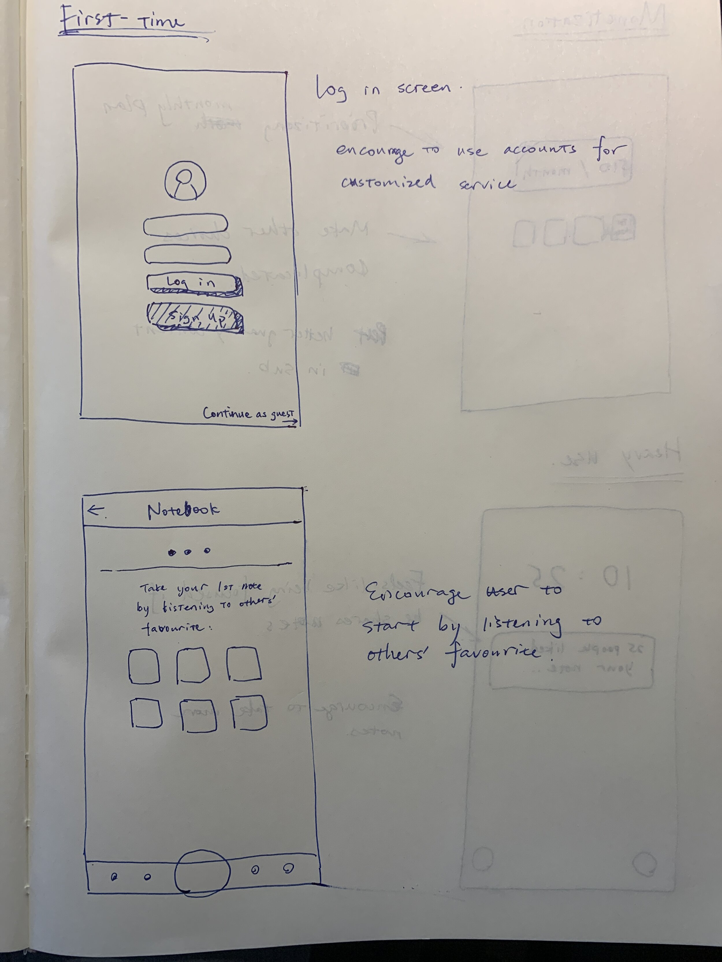
About the first-time user experience, I expect it to be intuitive, so my users can learn fast and easily.
Also, a lot of animations were designed to help the users to learn the gestures since the animation shows the detailed micro-steps and the precedence to the users which I expect to help them to remember.


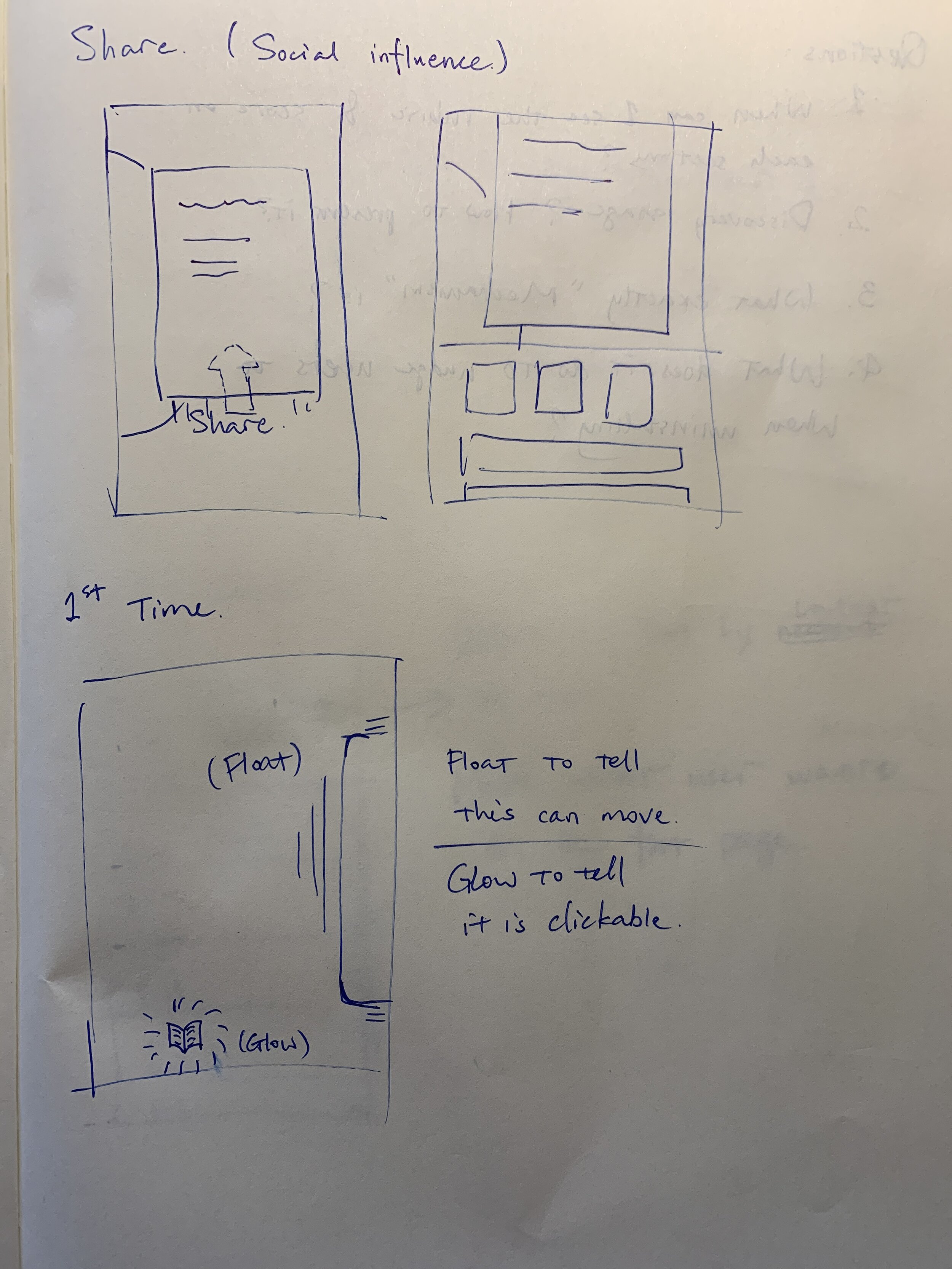
5.2 Two Sign-up Screens
Notice that I have two sign-up screens in the first-time user flow. One at the very start of the experience, one after the end of the tutorial. The first screen is like a warning sign telling users this app needs them to sign up and therefore the second signup screen won’t let the users feel like the app kidnaps their first note to force them to sign up.
Also, humans like to have benefits now and cost later, so I design an interactive tutorial to let the users have fun, with the candy first, it seems more acceptable to ask users to sign up.


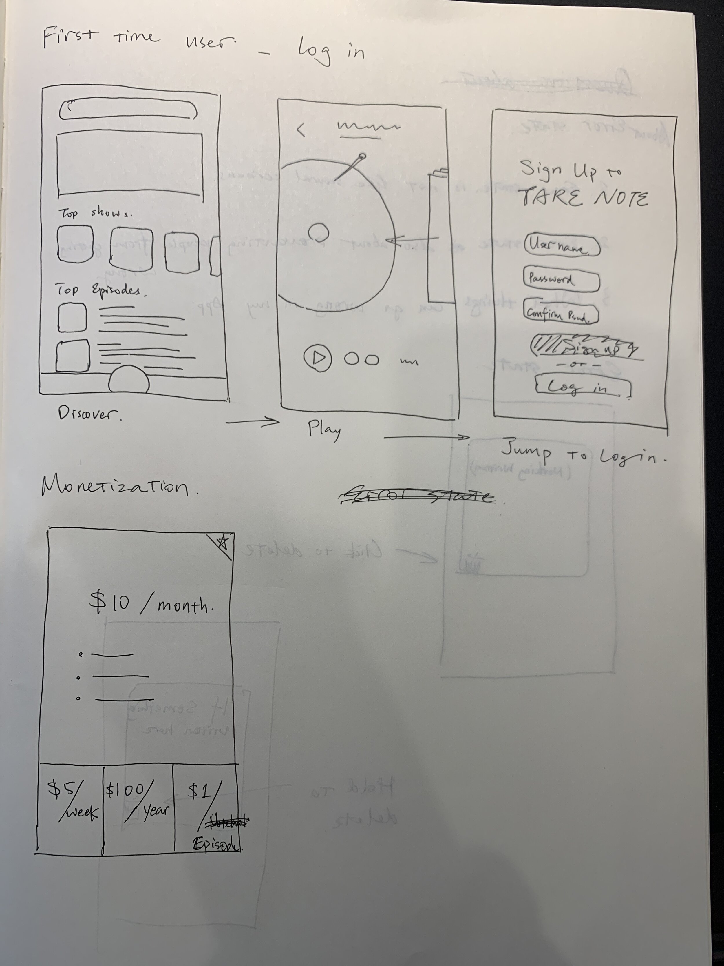
5.3 Pricing
About the pricing, I set a 1.99/week on the side, which is clearly irrational comparing to the 4.99/month in the middle, and also I set the monthly plan as default, so more people should choose the monthly plan among the three options.


5.4 Community
For the core users, they should have already had the membership, and using the app has already been a part of their lives. In this stage, daily notifications will be sent to their phones, about others’ comments or if they won the “community’s pick”, to keep them using the app.
Also, by putting users into the community, with the spotlight and herd behavior, they will be very loyal to the community, and therefore to the app.


5.5 Decent and Sincere Offboarding
Whether an experience is good or bad is largely decided by its start and its end, so even the user is leaving us, the ending experience should be pleasant. But still, we need to keep as many users as possible by error prevention.
First it filter’s out impulsive behavior by stating out how much effort the user has spent, second, it filters out the ones who just want to stop the payment, third, a checkbox will provide another chance before enabling and pressing the delete account button, and finally, the user still has 7 days to regret.
3
User testing
This reflection contains the outcome from the next project after the 5-week time limit of this project.
It was a 2-week group project I cooperated with my classmate Emily Traub and DeeDee Seojung Kwon.
It required us to evaluate the success of the behavior-changing features in the app we made by researches and user testings, and base on the result, come up with a report on the feasibility of the app changing user behaviors as a third party.

What We Tested
The overall behavior NoteIt was designed to encourage is note-taking while listening to podcasts, and these are the 4 parts of the app that may positively or negatively affect behavior change. But for the sake of this project, we decided to break this down a bit into just two parts:
If First Time User Experience design, including animated tutorial and 2 sign-up screens, communicates we intended
If people understood/were able to make sense of the LP graphic
- First Time User Experience (FTUE) -

1. Method: 30-minute “Think Aloud” Testings
We created a simple screener just to make sure that the people we were talking to had some experience listening to podcasts and also that they were comfortable sharing their screens.
Then we scheduled 30 min meetings with six people over Zoom - we started by sending participants a link to the first-time user experience prototype created in XD, and asked them to open it and share their screen, then think out loud - they were asked to say what they saw and what they thought as they went through the experience.
We also created a list of questions to prompt our participants and make sure we covered all the questions we had going in.

2. Feedback: Gesture Design and Animation
One of the words they said most about the gesture and the animation was intuitive.
Why is being intuitive so important? Jakob's Law states that people spend most of their time using digital products other than yours. Users’ experiences with those other products set their expectations. Failing to maintain consistency may increase the users' cognitive load by forcing them to learn something new. Also, according to the rule of thumb, people are more accepting when something follows their experience and expectation. So, in a word, they will use more.

3. Feedback: 2 Sign-up Screens
Based on the feedback we got from our participants, we found the notes setup made our users 1, get confused about how notes were saved and where they lived. 2. unsure about how many notecards they could use per episode. And 3, for all our participants, none of them realized they could revisit the exact timestamp that corresponded with their notes.
And about the second sign-up page, users were frustrated by being prompted to sign-up after so little time exploring the app. One of our participants told us that it would be much more possible to sign up the second signup page shows after he had taken 10 notes, but now he had just taken one so he had no motivation. A lot of them were also looking for a button to close the sign-up prompt. Some of them said if they could not close it, they would just not use our app.
So we were worried about if these problems will affect our goal of changing our user behavior in long term.
- LP Graphic -


1. Method: Survey
We sent out a survey to help us conduct both qualitative & quantitative research on the success of the LP metaphor and we get some results.

2. Quantitative Result
Overall our quantitative research showed that only nine out of eighteen people understood the LP representation. Three out of eighteen said they don’t know, and six said it was hard to understand.

3. Qualitative Result
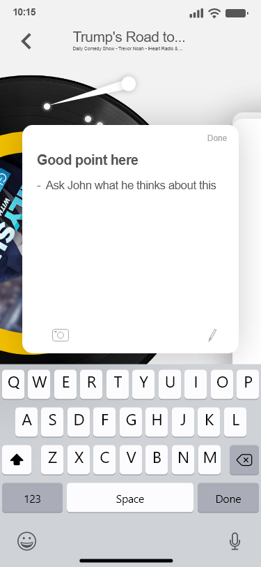
If we look at the quotes from participants, some participants have difficulty understanding LP shape, saying, "It seems to show more vinyl records or DJ sets than podcasts. To me, the podcast is more shape of the microphone.” So survey-takers suggested we change it to a microphone or a “timeline sequence of audio showing sound waves for better understanding of podcasts.
4
Reflection
- Current Problems -
Failing to maintain consistency may increase the users' cognitive load by forcing them to learn something new therefore our app will have fewer newcomers.
While our participants generally understood and liked the UI, and had an easy time remembering the animations, and gestures, they had difficulty with two aspects of the FTUE:
The process of adding and saving notes. As AT said:
“.. how do I get a new card? Because, it looks like I'm swiping it back into the ‘new card’ deck - it should swipe in the other direction, or when it's done, shrink into a box in the corner.”
The placement of the sign-up page. It was so frustrating to some users that it caused them to reconsider the app entirely. As TJ said:
“I like when websites say ‘Don't forget to sign-up or sign-in’ to save your progress, but if it just says ‘Don't forget to sign-up’ without giving me a reason, then I would probably reconsider using the app.”
I also found that many of the people we spoke with didn’t understand the LP representation of a podcast episode. As one user said,
“It's weird that it's a record since I know that podcasts are closer to a radio … when I see a record, I think of 50s jazz music, not Trevor Noah."
LP graphic causes a wrong impression to our app, and for the users, it is a large cognitive load to give the LP disc another meaning. Our goal is to encourage users to start to use our app and start to take notes, so it is a waste of users’ cognitive load and the LP graphic may cause fewer first-time users to accept our app.
- Future Improvements -
Moving forward, I plan on giving users more time to explore the app before prompting them to sign-up, and rethinking the design of the note-taking set up to make it clear where notes “live” once they are saved, how many notecards can be used per episode, and how to revisit the timestamp that corresponds with their note.
It has also become clear that I need to replace the LP graphic with something that is more representative of a podcast episode.